Is there anything as intrinsically Americana as roadside signs?
For as long as Americans have been getting their kicks on Route 66 and other highways and byways, drivers have been treated to iconic roadside signs from Burma-Shave billboards to the neon glow of “Welcome to Fabulous Las Vegas Nevada.”
As soon as the first modern drive-in gas station opened in Pennsylvania in 1913 on the corner of Baum Blvd and St. Clair St. in Pittsburgh, roadside signage has been crucial to capture the business of those driving by.
Much like today’s c-stores, that first drive-in station was staking its business model on more than just filling up your gas tank: “In addition to gas, the Gulf station also offered free air and water – and sold the first commercial road maps in the United States,” according to the American Oil and Gas Historical Society.’
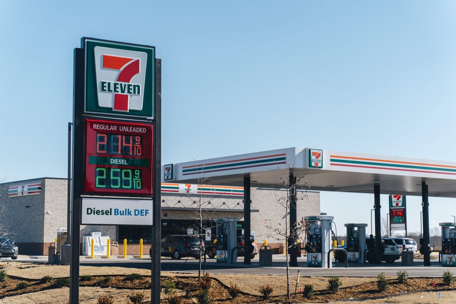
Those eye-catching gas station signs of yesteryear have evolved into today’s c-store digital signage, such as PWM’s LED Profit Boards, that can advertise directly to people passing by the business every day.
Making Sure Your Roadside Tech Works for Your Message
The global digital signage market is expected to reach $27.8 billion by 2026 from $16.3 billion in 2021.
The outdoor segment of digital signage, riding a wave of new technology, is expected to grow even faster than the overall industry’s 11.2 percent annual growth rate.
Making sure you have digital roadside signage capability is the first step, but some business owners may have trouble taking full advantage of what is at their fingertips.
“Sure, you’ve got an eye-catching image to draw people’s attention to your billboard or other signage as they drive by, but the information you want to share needs to be clear and concise or what’s the point?” asks Digital Signage Today.
Things to consider when trying to get your message out:
- Alignment
- Colors
- Contrast with the background
- Font and Font size
- Lower or Upper Case
- Spacing
- Style
“Digital signs are becoming very much the standard for roadside signage across the country and bring a whole new set of considerations when designing messages for these signs, like is the image static or in motion?” says Digital Signage Today.
Can You Read Me Now? Choosing the Right Font
You will want to keep the fonts on your roadside digital signage simple and easy to read so sans serif fonts work best.
Sans serif refers to fonts that do not have extending features (called serifs) at the end of the strokes.
Outdoor messaging can work best, according to Digital Signage Today, with the following sans serif fonts:
- Arial
- Calibri
- Futura
- Garamond
- Helvetica
- Tahoma
- Trajan
- Verdana
Digital Signage Today says some other “font rules” to live by include:
- Thin letters are harder to read from a distance so make sure your font weight is not too light
- Avoid “fancy” fonts and stay away from all script and gothic fonts
- Do not mix two fonts in one message
Life in the Fast Lane: Speed and Pixel Pitch
Your digital roadside signage will work best when you walk a mile in a customer’s shoes – or at least drive around the block and see what they will see.
“How fast someone is going past your roadside signage is also a factor. For example, if the speed limit is 35mph, the message should be visible for three seconds by passing drivers,” says Digital Signage Today.
Are you up to date on your pixel pitch? Pixel pitch refers to the density of pixels (LED clusters) on signage and is important because it influences viewing distance.
Basically, the smaller the pixel pitch, the closer the viewing distance required.
Digital Signage Today recommends the following breakdown for pixel pitch, height of letters and font point size:
- Minimum Sizes: 7 inches, 18 pixels, 13 points at 35 mph; 10 inches, 25 pixels, 19 points at 45 mph; and 13 inches, 32 pixels, 25s point at 55 mph
- Recommended Sizes: 18 inches, 46 pixels, 35 points at 35 mph; 23 inches, 58 pixels, 77 points at 45 mph; and 28 inches, 70 pixels, 119 points at 55 mph
- Maximum Impact: 35 inches, 80 pixels, 67 points at 35 mph; 46 inches, 116 pixels, 155 points at 45 mph; and 57 inches, 152 pixels, 243 points at 55 mph.
Try to avoid all caps, which can be hard on the eyes by combining lower- and upper-case letters in your message. If you want a word to jump out – go for bold vs. all caps.
White space is good so edit down your messages rather than trying to cram a letter into every available inch on your roadside signage.
And when in doubt about font sizes and letter heights – bigger is always better than smaller.
Creating Your Digital Roadside Signs for Maximum Impact
Digital Signage Today says that even if your roadside signage has the ability to add visuals, concentrate on your text as the message is the key.
Other considerations:
- Lighting: Check your roadside signage at all hours to make sure glare is not an issue.
- Surroundings: Make sure the background to your signage complements, not competes with your message.
- Test: Adjust your signage based on field testing, user experience.
Contact PWM today to find out more about roadside digital signage that can practically drag people into your c-store.